Have you ever wondered where the people moving into Cobb County are coming from? Or for that matter, where people moving away from the county are headed?
The U.S. Census Bureau has an interactive map that can help you discover the flow of people moving to and from the county.
The mapping tool is called the Census Flows Mapper, and the Census Bureau announced today that they’ve updated the tool with the American Community Survey data from 2015-2019.
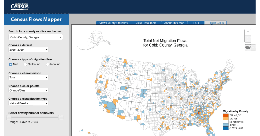
When you visit the map, available by following this link, you are presented with the option of entering a county (or metro area) name in the upper left-hand corner. See the red arrow in the image below:

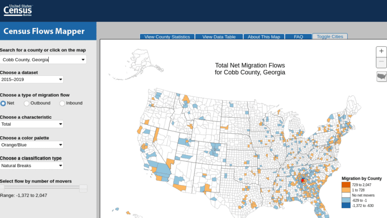
I’ll enter “Cobb County,” but you can actually enter any county or metro area you are interested in. You’ll be taken to a map that looks like this:

Note that the map is color-coded. The different colors indicate the net migration. You can find out whether the migration is to or from Cobb County by clicking on any of the counties on the map. If it displays a negative number it means the flow was from Cobb County to the selected location. A positive number means the direction of migration was into Cobb County.
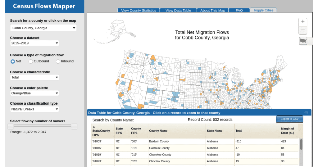
Also it might be easier to view the results as a table. On the top of the map there’s a tab labeled View Data Table. If you click on that it takes you to a view that looks like this:

If you click on the column labeled “Total” it will sort the data by net migration.
My first click showed that the main places people moved to if they moved away from Cobb County were Cherokee County, Douglas County, and Clarke County (all within Georgia).
The second click, which sorted with the net positive on the top of the table showed the three top places for migration into Cobb County were Fulton County, DeKalb County (both in Georgia), and Cook County, Illinois.
You can also export the data to a comma-separated value (CSV) file so that you can work with it in your favorite spreadsheet program.
For a more detailed tutorial on how to work with the Census Flows Mapper, take a look at the video I’ve embedded below:
